A highly organized creative disorder run by questionable management, where one person somehow does everything. Years of exploring different disciplines created an identity disorder — designer, strategist, marketer, and problem solver all working under one roof. Instead of staying in a single lane, these perspectives work together to build stronger ideas, connect creative thinking with business goals, and turn concepts into real solutions.
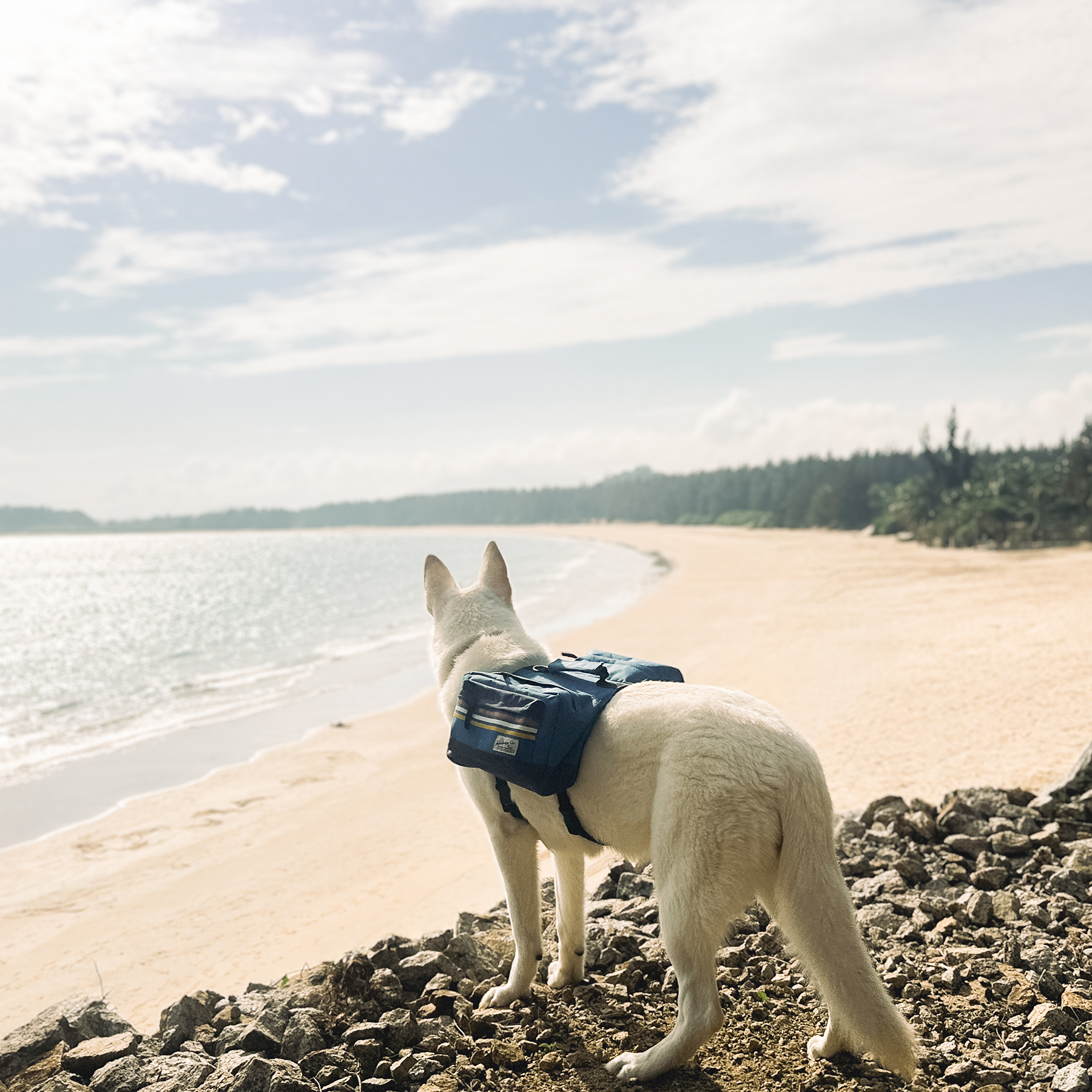
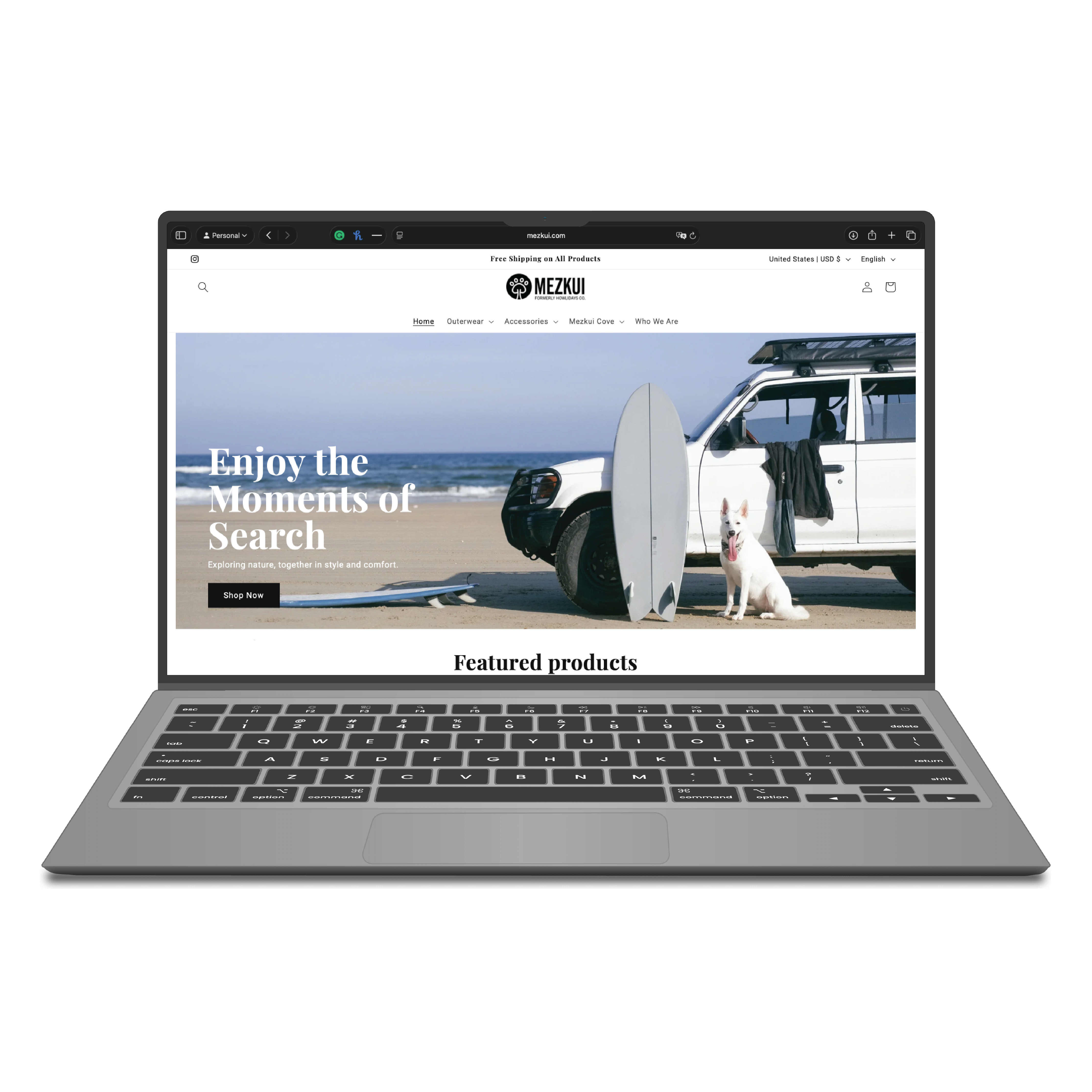
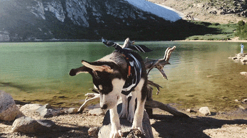
Building a lifestyle brand that connects dogs, humans and outdoor exploration.
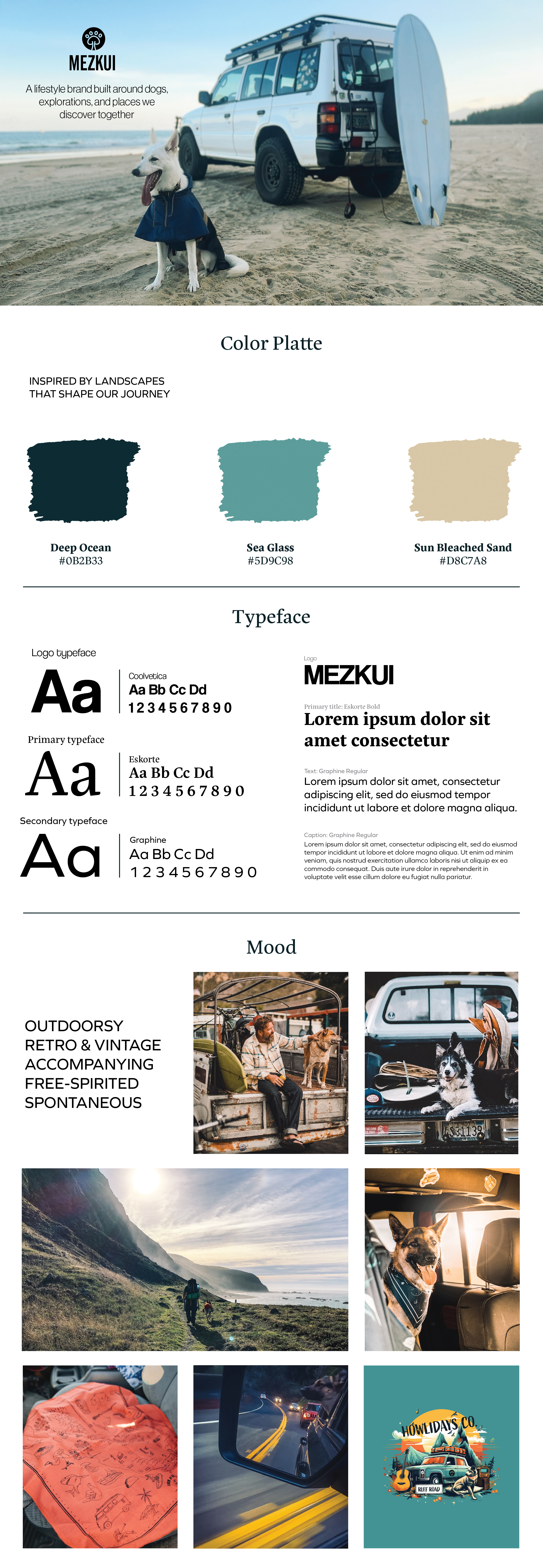
Market research and competitor analysis revealed a major blind spot: most dog apparel brands focus purely on utility, completely forgetting that the human is the actual customer. Buyers demand more than just the product itself—they look for items that mirror their own lifestyle, identity, and personal aesthetic. I founded this brand to bridge that gap, pairing functionality with designs that celebrate the deep emotional connection between people and their dogs.
Outdoor lifestyle. Adventure driven. Nature connected.
Dog as family. Values connection.
Seeks meaningful, unique products.
I transformed the research insight into a complete brand identity inspired by desert landscapes, surf culture and outdoor exploration.
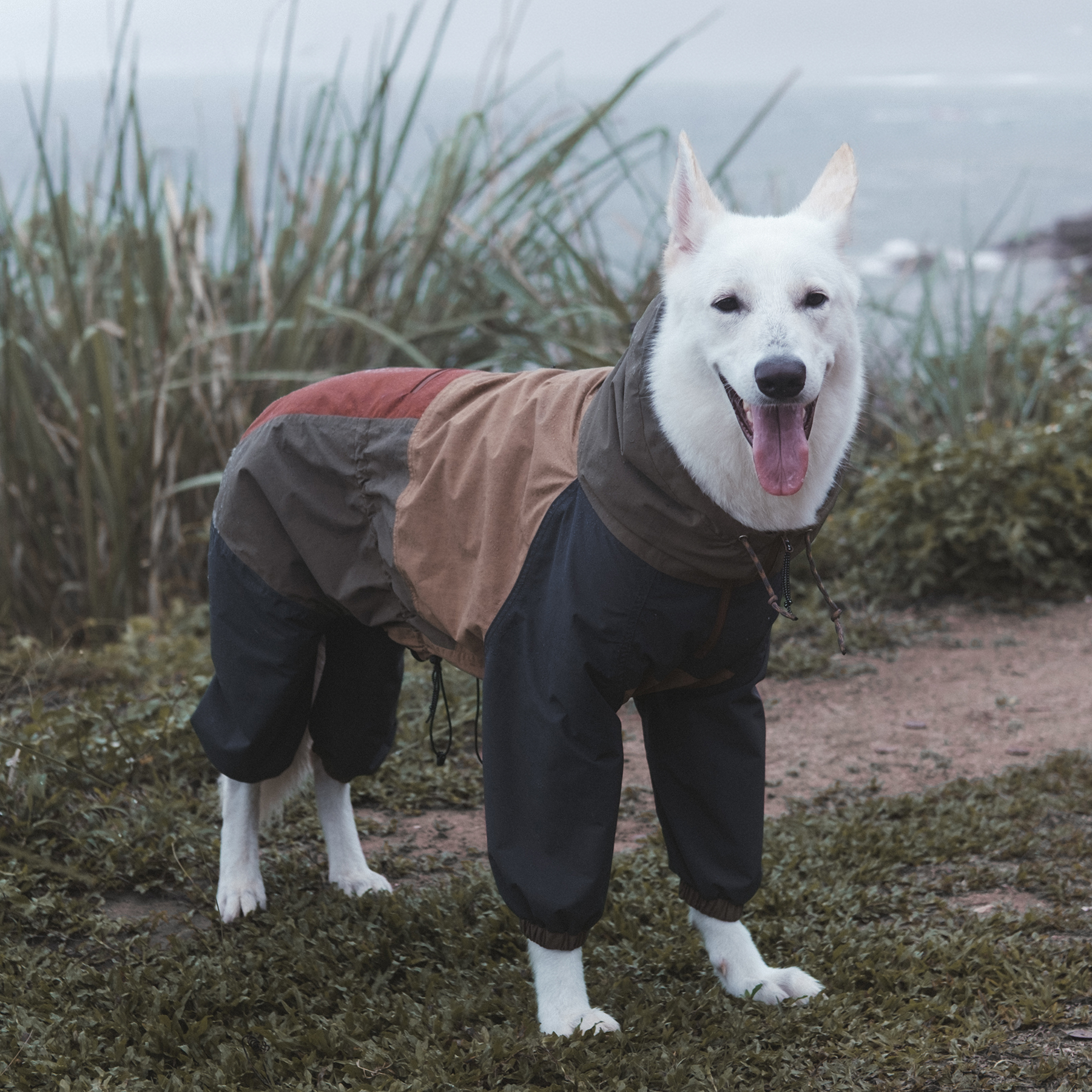
From concept to physical product, I designed products through both 2D development and 3D visualization.
Exploring shape, proportion, materials and construction before physical production.
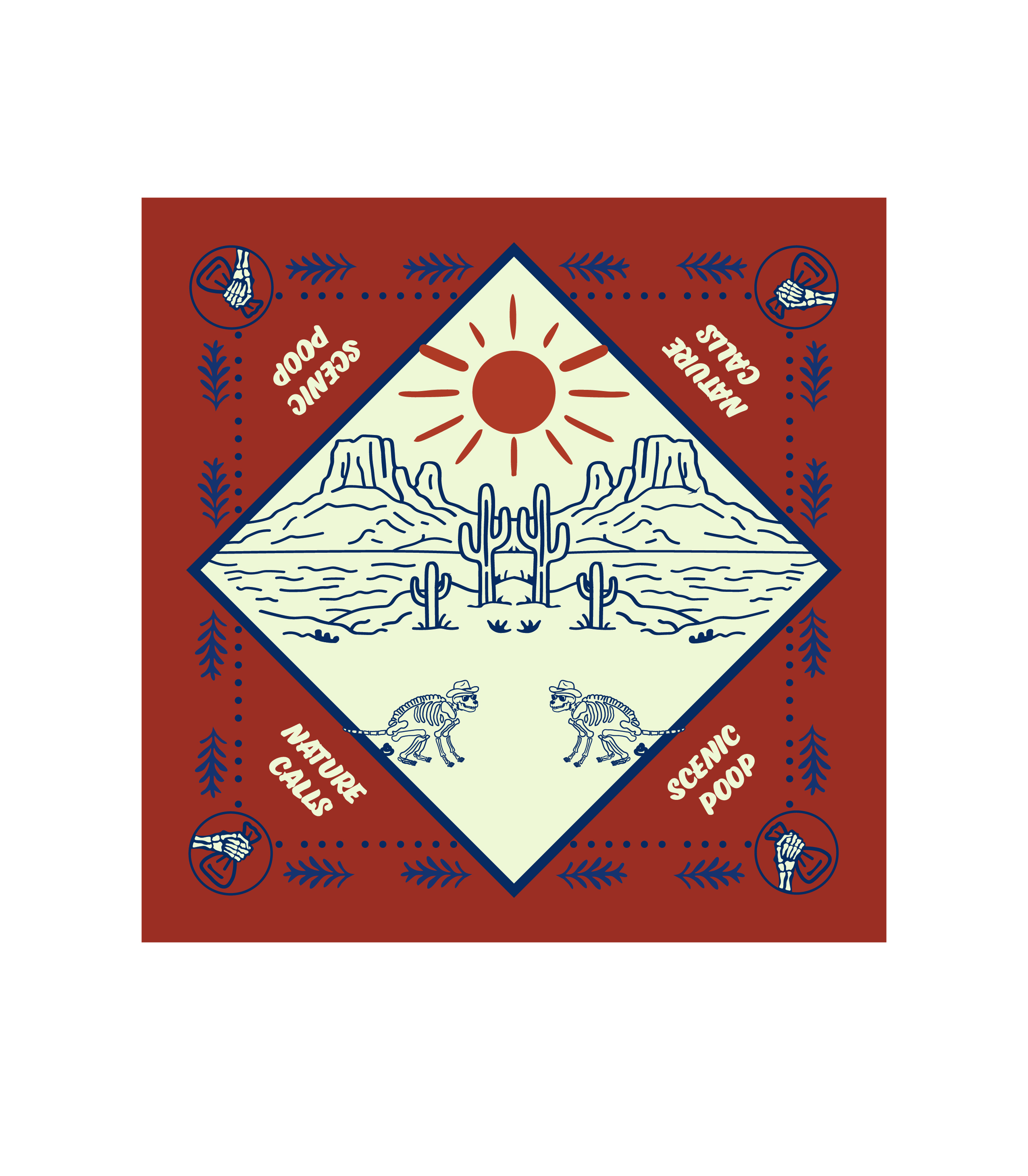
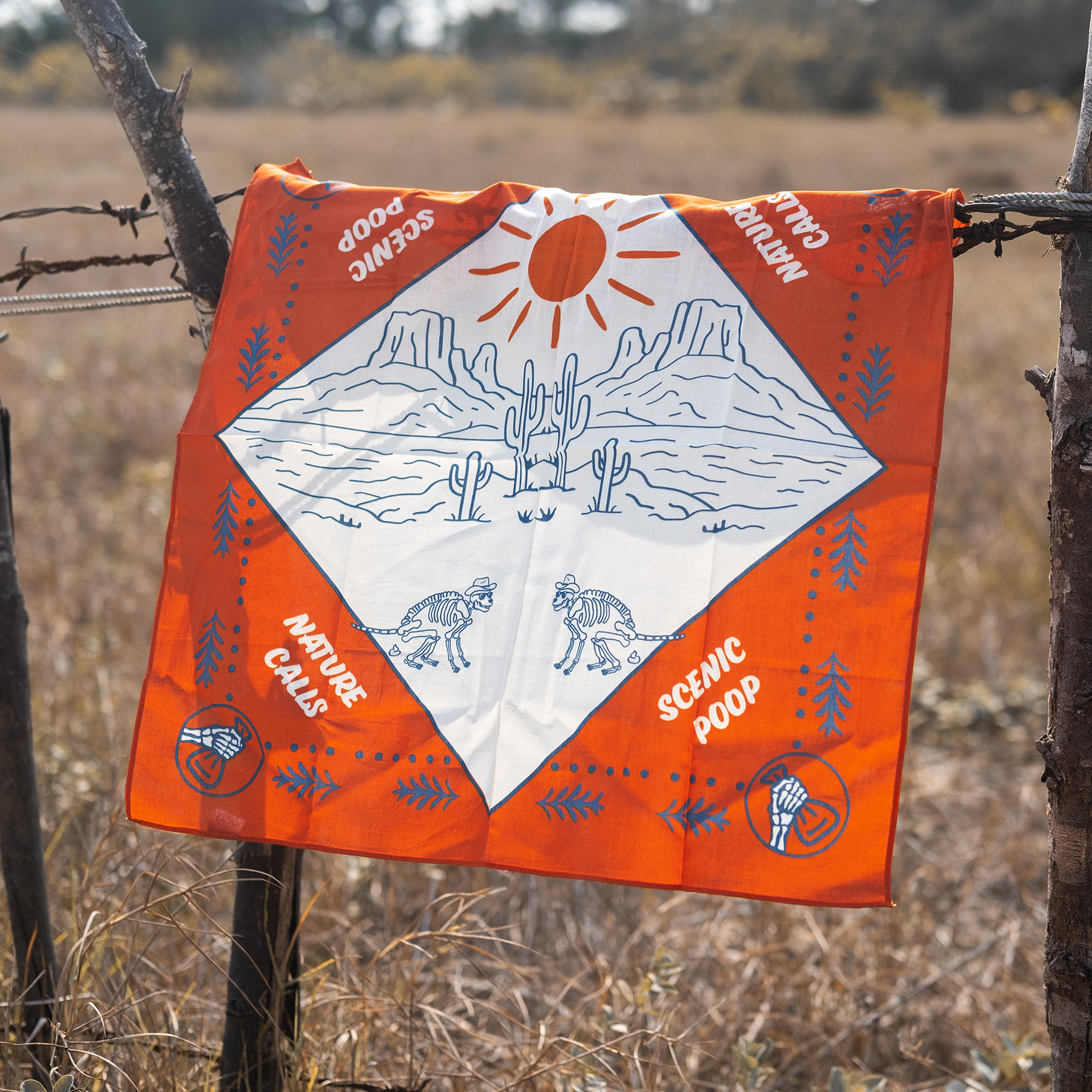
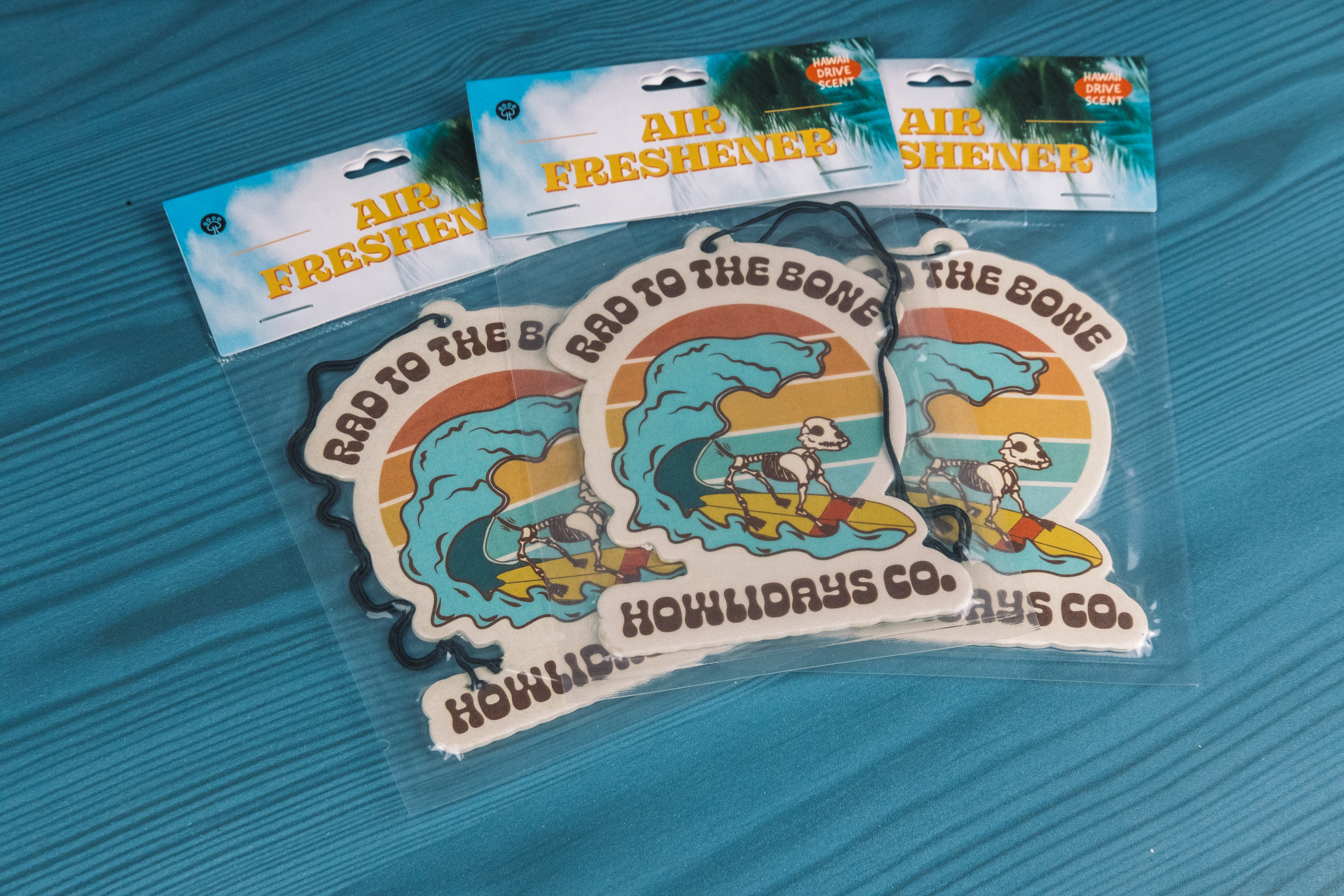
Developing prints, graphics, patterns and product details that communicate the brand story.
Product Design
Graphic Design
Packaging Detail
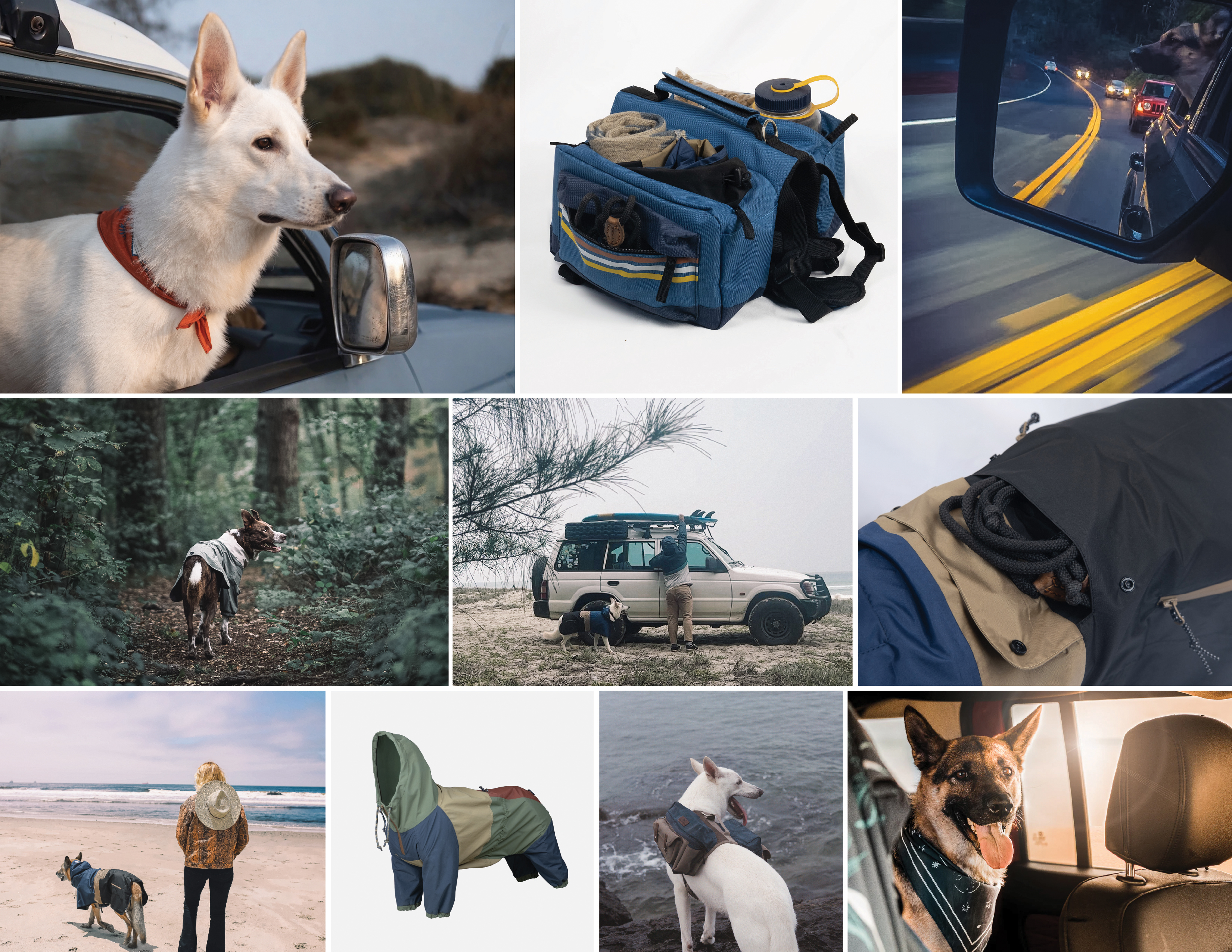
A lifestyle brand is more than just its physical products. I led the creative direction and full production, steering everything from visual design to content storytelling to build a cohesive universe. Together, these touchpoints create an immersive experience that builds a deep emotional connection with our audience.
Brand Design
Market Research
Visual Identity
Product Design (2D / 3D)
Packaging Design
Photography Production
Website Design
Digital Experience
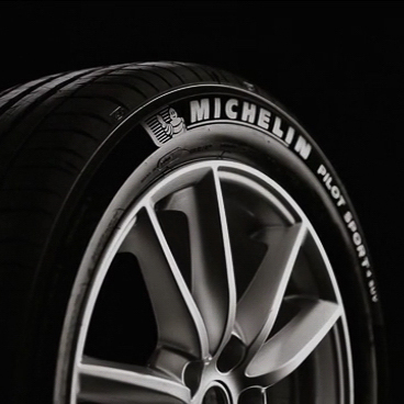
Breaking the visual language of automotive advertising by transforming a tire into a luxury object.
For decades, tire communication has followed a predictable formula. Performance. Technology. Engineering. The tire was always presented as a machine component rather than an object of desire.

Michelin introduced a new sidewall technology creating an extremely black surface with a velvet-like texture. Instead of explaining the technology, I challenged the agency to showcase it through the visual language of luxury.
By borrowing the codes of luxury watchmaking — precision, material, craftsmanship and exclusivity — the tire became more than an engineering product. It became an expression of taste and identity.
Branding Team
Creative Direction
Product Launch Strategy
Category Reframing
Turning decision fatigue into a playful ordering experience.
Snarf's Sandwiches had a vibrant offline personality, but its digital experience needed to be more engaging and memorable. The goal went beyond building a basic online ordering system. It was about crafting a digital journey that helped customers discover their perfect sandwich while keeping the decision process fun, effortless, and distinctly Snarf's.
Through customer surveys, mystery shopping and UI/UX testing, I identified friction points within the digital ordering experience.
Understanding ordering behavior and customer expectations.
Experiencing the brand firsthand to understand the food, atmosphere, and customer journey.
Identifying moments of confusion and hesitation.
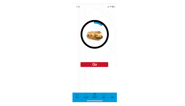
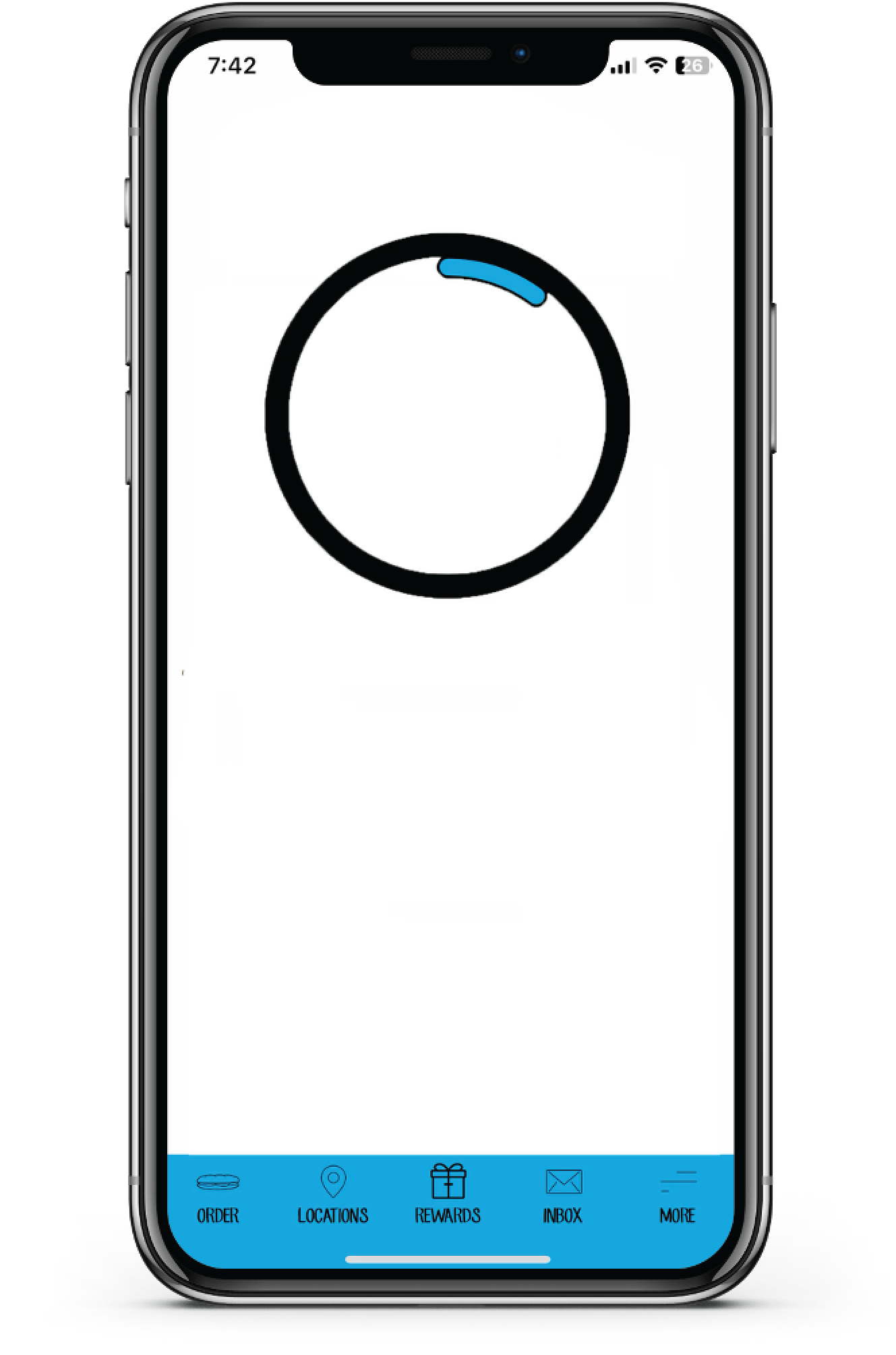
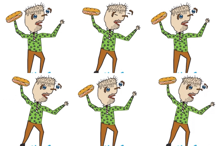
Research revealed that the digital experience was not adding enough value. Since convenience was a key reason customers chose Snarf's, I designed a playful sandwich selector that simplifies choices across the large menu while creating an experience that feels uniquely Snarf's.
(Demo)
Hit the "Surprise Me" button
Yes, the font is Comic Sans. No, my keyboard wasn't hacked. Comic Sans was part of Snarf's existing identity, and honestly... it made sense. The imperfect, playful personality matched the brand's fun and unconventional character.
Marketing Research
Consumer Insight
UX Research
UI/UX Design
Feature Strategy
Designing a customer retention ecosystem by turning uncertainty into confidence.
Projected ROI
Translogic aimed to strengthen relationships with existing customers, improve long-term retention, and encourage future upgrades.
Customers were not asking:
"Why should we buy?"
They were asking:
"How do I prove this investment
is worth it?"
Through customer journey mapping, market research and stakeholder analysis, I identified that the key challenge was not product awareness, but a lack of understanding from the customer's perspective. Customers needed clearer visibility into how modernization could create value for their own business before making the decision.
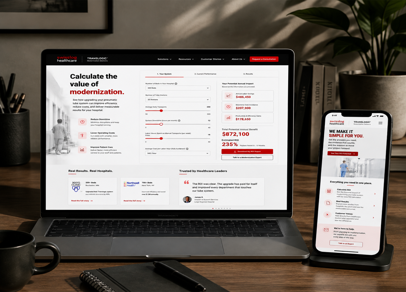
An integrated retention campaign designed to help customers build a stronger business case for modernization.
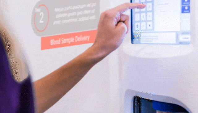
A personalized landing page combining ROI calculation, case studies and testimonials to help decision makers communicate value.
Targeted email campaigns guided customers toward the resources needed to make informed modernization decisions.
Marketing Strategy
Customer Journey Mapping
Campaign Design
UX Strategy
Digital Experience Design
A marketing campaign concept for Honest Botanist that communicates the spirit of cannabis without showing cannabis.
How do you advertise a cannabis brand when traditional product-focused advertising is limited?
Instead of promoting the product itself, I focused on the emotion behind it: creativity, imagination and breaking boundaries.
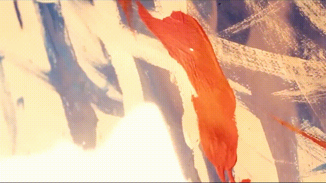
Start with abstract artwork to create mystery.
Reveal the unexpected creator behind the artwork.
Connect creativity and self-expression back to the brand.